Are You Board Yet?
STA/ISS 313 - Project 1
Abstract
In our project, we sought to determine whether there were any interesting trends within the TidyTuesday Board Games dataset. We want to know if games with higher differences between the minimum number and the maximum number of players tend to be more highly rated as well as how the number of expansions for board games changed over time, and whether or not they have had an impact on game ownership. To answer the first question, we utilized a scatterplot, line graph, and heatmap, finding that there was a weak relationship between the differential and the ratings of the respective board game. To answer the second question, we used a path diagram, which indicated that the number of expansions and the average rating of newly-released games were both increasing over time, and a series of boxplots, which told us that games with more expansions generally had higher ownership than those with fewer expansions.
Introduction
The Board Games Tidy Tuesday dataset, published on January 25th, 2022, was originally collected from Kaggle. It combines board game descriptions and reviews from Board Game Geek, which is an online community for board gaming hobbyists.
With 8202 board games, the data set includes 28 characteristics: id, primary, description, yearpublished, minplayers, maxplayers, playingtime, minplaytime, maxplaytime, minage, boardgamecategory, boardgamemechanic, boardgamefamily, boardgameexpansion, boardgameimplementation, boardgamedesigner, boardgameartist, boardgamepublisher, owned, trading, wanting, wishing, rank, average, bayes_average, users_rated, url, thumbnail.
Question 1: Are games that allow wider ranges of players more highly rated?
Introduction
Do games with larger differentials in player counts (e.g. can support a wider range of players) tend to be more highly rated? We wanted to analyze this question because it seems intuitive that games with a wider range of player counts are easier to play in social settings like parties or small gatherings, but we weren’t sure whether it had any effect on the game’s perception (rating).
This first question of interest will utilize the variables in the data set that represent the minimum number of players, the maximum number of players, and average rating. We’re interested in this question because we’re curious whether games that accommodate a wider number of people receive higher ratings generally or not. This could suggest that players enjoy and value the option to include more players in their game.
Approach
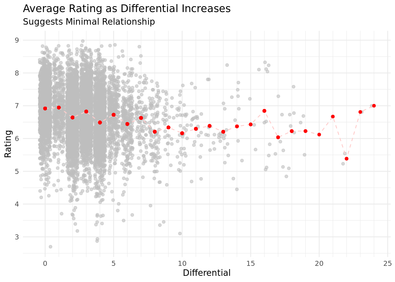
To address this question, the first plot we made visualizes how the rating changes as the differential between the maximum and minimum number of players increases. The differential is plotted on the x-axis and the rating is plotted on the y-axis. A scatterplot is most effective in displaying all the points in order to show the audience that the majority of board games have differentials of around 0 to 5 players. We combined this with a line graph because incorporating a line connecting the average rating for each differential more clearly and immediately suggests the lack of relationship between the variables of interest.
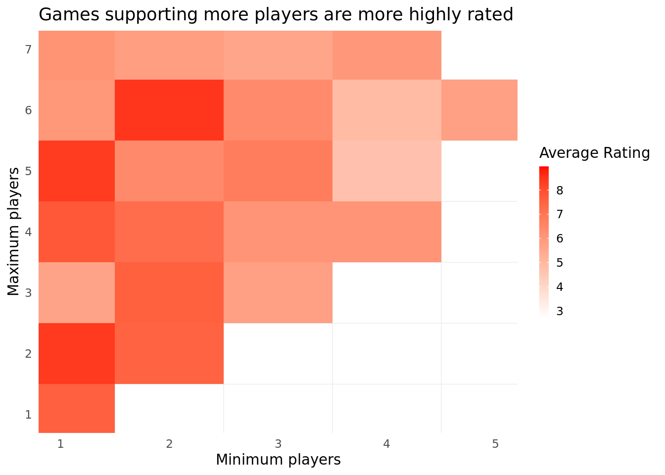
We also created a heatmap to visualize the average rating of a game based on both the minimum and the maximum number of players. The minimum number of players is plotted on the x-axis and the maximum number of players is plotted on the y-axis with the average rating as the fill for the heatmap. The darker red the fill, the higher the average rating was for the game at that coordinate. We zoomed into the map with limits of x = (1,5) and y = (1,7) because there was not much data beyond that range. The heatmap displays similar data to the scatterplot created before, but it is still useful to support our observations in the scatterplot. A heatmap allows us to visualize minimum players, maximum players, and the average rating without creating a differential variable. This way, we do not lose information about the maximum and minimum number of players, while still gleaning information about the interaction between the two.
Analysis
Discussion
From the first plot, the red line that connects the average ratings suggests that there is a minimal relationship between the differential of players and the board game’s rating. This is surprising to us because we had initially believed that games that can incorporate a wider range of people would be more popular since you would be able to play it in a greater variety of scenarios (with more or fewer players). Similarly, we noticed in the dataset that games with larger differentials were commonly classified as party games or trivia games, which we also speculated may increase their rating. We can see that the number of board game observations decreases as the differential increases, so this can explain why the trend line is less consistent as the differential increases. We speculate that there are fewer games that have greater differentials in general, so that is reflected in this dataset.
The second plot also shows a minimal relationship between the number of players and the average rating of the board game. There is a slight concentration of higher ratings with games that have higher maximum player values and lower minimum player values. Towards the outskirts of the graph, we see that most of the games are rated fairly low. This somewhat supports are initial intuitions that games that support a wider range of players are more highly rated, which may explain to some extent the higher ratings on the left side of the heatmap. However, the data is not strong enough to make any definitive conclusions.
Question 2: How do expansion releases correlate to rating or ownership?
Introduction
Our second question is “How have the number of expansions for board games changed over time, and have they had an impact on game ownership count?” On an anecdotal level, we are hearing more about expansions to previously released games in recent years as a way of capitalizing on a game’s popularity. We want to know whether there have been more expansions in recent years and if the number of expansions a game receives correlates with either rating or popularity (this seems like an intuitive hypothetical relationship.) We’ll look at variables like the expansions a game has received, its rating, its total ownership (as an imperfect, but best available, proxy for overall popularity), and the year it was released.
Approach
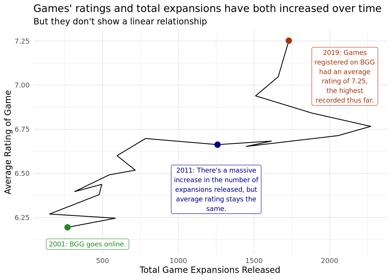
For our first visualization, we use a path diagram. We make this unconventional choice because we want to trace the progression of two continuous variables, the average rating on the y-axis and the number of expansions on the x-axis, over a time period that is independent of either axis. We start in the year 2001, which is when BoardGameGeek is launched (and thus no game is unfairly hindered by not having ratings available over its entire release lifespan) and track the games until 2019. We don’t proceed until 2022 because there would naturally be fewer expansions available for newer games, which would heavily bias our data.
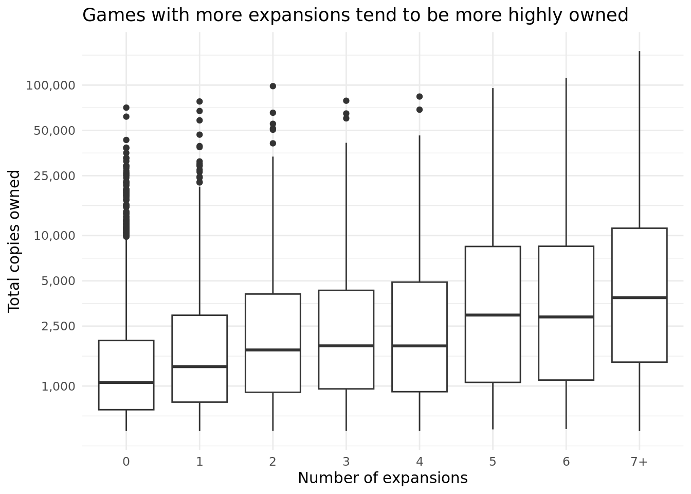
For the second visualization, we decide to create boxplots to see the distribution of ownership for games with a certain number of expansions (for example, how does the distribution of games that had one expansion compare to the distribution of those with three released expansions?). We rewrite the number of expansions as a factor on the x-axis and use the log-transformation of total ownership on the y-axis. We topcode the factor at 7 expansions because the distribution of expansions is incredibly right-skewed (most games have few expansions), and too many boxplots would appear visually cluttered while the distributions themselves would mean less. We log-transform total ownership because it is similarly incredibly skewed and thus log transforming allows for greater visual clarity. This visualization could have been completed using facets (facet by the number of distributions and use density or other distribution measurements), but we believed that side-by-side boxplots captured most of the relevant data with greater clarity.
Analysis
Discussion
In the first path diagram, we see that the total number of expansions is generally increasing year-over-year, as is the average rating of games. However, their relationship does not appear to have any specific pattern. For example, from 2011 to 2015, the average rating of games released in those years barely improved even as the number of expansions to games released in those years exploded. Of course, we would expect the correlation between these two to be loose since the number of expansions can also be explained by the time since the year of publication. Otherwise, however, the general trends in this data make sense. Games are probably becoming better as the industry expands and designers have better technology and more experience. The growing market for board games also likely explains the growth in expansions, and we expect the number of expansions for games released in a given year will change if we revisit the data several years from now.
In the second diagram, we see differences in the distribution between games that have many expansions and games that have few. Regardless of their number of expansions, most games have little ownership; the median ownership for all categories of games was under 5,000. Almost all of the categories have very popular games, with 25,000 - 100,000 owners roughly. However, there are differences between the ownership distributions of games with 0-1 expansions and 5-7+ expansions; their medians, 25th, and 75th quartiles are all lower. This seems to imply that while there are plenty of very popular games that do not receive expansions and plenty of very popular games that receive many expansions, overall, games with fewer expansions have fewer owners generally.