A Student’s Review of Expert Reviews of Chocolate Bars
STA/ISS 313 - Project 1
Abstract
In this project, we aim to explore what characteristics (as identified by experts) of chocolate bars lead to the most successful chocolate bars and how expert opinions of these characteristics have changed over time. Our data suggests that companies that specialize in a specific cocoa percent range and get their cocoa beans from Central/ South America and Southeast Asia are the most successful. The data also suggests that experts have grown to highly rate chocolate that contains a high cocoa percentage over lower cocoa percentage chocolates and American-based companies have been taking the lead in highly rated chocolate over their European counterparts as the years go on.
Introduction
Our main dataset is the chocolate dataset. It contains information about chocolate bars and reviews written by experts. It contains 10 variables with 1795 observations. This dataset contains information about the company who makes the chocolate bars, the percent of cocoa, where the company is located, bean type & origin, expert review (out of 5 stars), and the date and reference number for each review. The original data source can be found here and more in depth information can be found in our data dictionary located in data/README.md in this repository.
Our other datasets include world and con2cont and they are primarily used in our plots that include geospatial variables. con2cont maps countries to continents while the world dataset gives us coordinates to graph so that we can make map-like visualizations.
Question 1: What characteristics lead to the most successful chocolate bars?
Introduction
We aim to explore what characteristics of chocolate bars are the most successful as rated out of 5 stars by experts. This information is important for consumers so when they are in the candy aisle at grocery stores faced with dozens of options, they can use these findings to make a well-informed decision about which chocolate they should buy. This is also important for chocolate makers to understand so that they can use this information to improve their own chocolate given the location preferences.
To answer what characteristics lead to the most successful chocolate bars we will use the variables that describe cocoa percentage in the chocolate, the various companies who are included in this dataset, the origin of the cocoa beans that are used to produce that chocolate bar, and the expert reviews of the chocolate bars.
Approach
Figure 1
For this first plot (Figure 1), we wanted to visualize how the cocoa percent in a chocolate bar affects the expert review based on where the chocolate company is located. We believe that there might be general trends for each country that lead to chocolate being more highly rated if the population preferred a specific cocoa percentage. For example, we know Americans have a strong preference for sweeter, less cocoa-filled chocolate and wanted to know if a decrease in cocoa percentage would lead to an increase in reviews.
To visualize this, we first created a scatterplot to get a general idea of the relationship between a country, their preference for cocoa, and how that might affect the rating. The points were somewhat all stacked on top of each other since a lot of observations had very similar positions. This made it hard to see overall relationships so we made the points a little transparent to better communicate more frequent cocoa percentage and rating pairings through more concentrated colors. Then we layered trend lines over our scatterplot for 8 countries that are best known for the chocolate they produce (according to outside research). We also chose these countries because they had over 30 companies who manufactured and sold their chocolate there so we thought we would get a pretty representative sample of companies for each country. These countries include U.S, France, U.K, Italy, Ecuador, Belgium, Switzerland, and Germany.
Figure 2
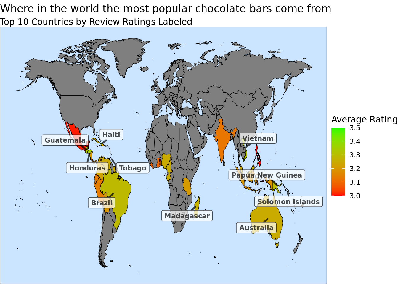
For this second plot, we thought it would be interesting to observe the relationship between the origin of cocao beans and the expert reviews. Furthermore, given how neighboring countries often have similar climates we believe that preferences for beans from nearby countries should be similar. In order to investigate these relationships we decided to create a map.
The map was created using the maps package (with inspiration taken from here). We left_joined the world data set with the average rating for each country from the chocolate data set. This new dataset contained the latitude and longitude coordinates from the world data set which allow us to use the geom_polygon function to create the baseline for the map. The countries were then colored based on rating to show the preferences for their bean origin. Finally, we decided to add labels for certain countries. We tried many variations of labels so that the plot was not cluttered but still provided additional information. The labels chosen highlight which countries were the most popular, further showing which areas contained the most popular bean origins.
Analysis
Figure 1
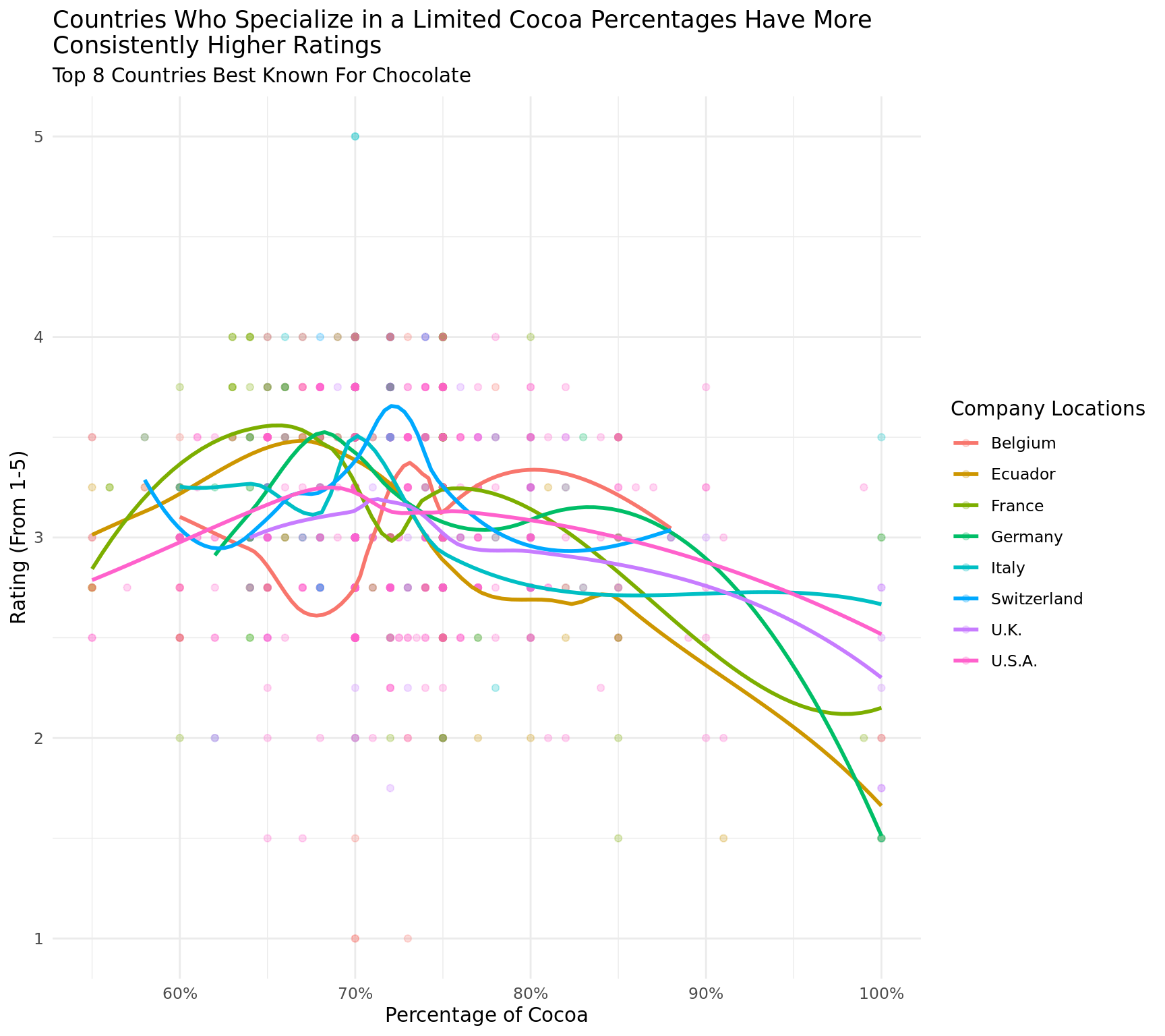
Figure 2
Discussion
Figure 1 shows quite a bit of variation between cocoa percentage and expert ratings across countries. Across all the trend lines for the top 8 countries, we see a general decrease in rating as cocoa percentage increases. This makes sense given most people prefer lighter chocolate bars that have less cocoa percentage. Even dark chocolate lovers may not prefer chocolate with a cocoa percentage over 80% according to our graph and outside research. One interesting thing to note, is that chocolate manufacturers in Belgium and Switzerland seem to specialize in a limited range of cocoa percentages which lead to more consistent ratings. In the other 6 countries we see dives into the low ratings, especially as cocoa percentage increases, which will affect their overall average rating across all their chocolates. Belgium and Switzerland are able to maintain a higher average rating across all their choclates seemingly because they chose to only produce chocolates in a certain range. Of course there could be other factors not included in this analysis that may affect their average expert rating. Let’s take a look at how the location of the harvesting of cocoa beans may affect rating.
The second plot does reveal a spatial clustering that we expected. The countries that produce cocoa beans exist in two man areas, Central/ South America and Southeast Asia. However, there is no specific area that stands out as the best for producing cocoa beans. There are 5 countries from each area that make up the top 10, and there are also come of the worst performing cocoa beans in these regions. It is likely that cocoa does require specific conditions for growth but seemingly as long those conditions are met the preferences for beans has more to do with specific processes within the countries then climate related.
Question 2: How have preferences among chocolate bar reviewers changed over time?
Introduction
As for our second question, we aim to investigate how the preferences of the chocolate bar reviewers have changed over time. We believe that this information will be useful for both the consumers and the producers: the consumers will be able to make informed decisions when purchasing chocolate and the producers can potentially use this information in modifying and improving their products competitively.
To explore the preferential change over time in chocolate bars, we will be using the variables that describe the year a chocolate bar review was written, the mapped continents in which the companies are located, and the ratings received in each review.
Approach
Figure 3
To create the first plot, we created line plots by year that show the relationship between the cocoa percentage of the chocolate bar and their ratings. In creating the variable with year information that will be used in faceting the plots, we grouped the year information provided in review_date into two year increments to create a new character variable (year_even) using the mutate function. We made this choice as 12 separate graphs (one for each year instead of for two years) would provide too much clutter, and it would be hard to visualize the trends across time. We also made a new variable, avg_rating, that stores the average rating for a cocoa percentage in a certain year by grouping the data by year_even and cocoa_percentage. For the plot, our x-axis variable is the cocoa percentage and the y-axis variable is the rating. The plot will be faceted into 6 time periods assigned within 2006 ~ 2017. We created linear line graphs and scatterplots so we can see the overall trend of how ratings change as the cocoa percentage changes as well as some variation in the data, and we faceted by time periods how this relationship changed as time changed.
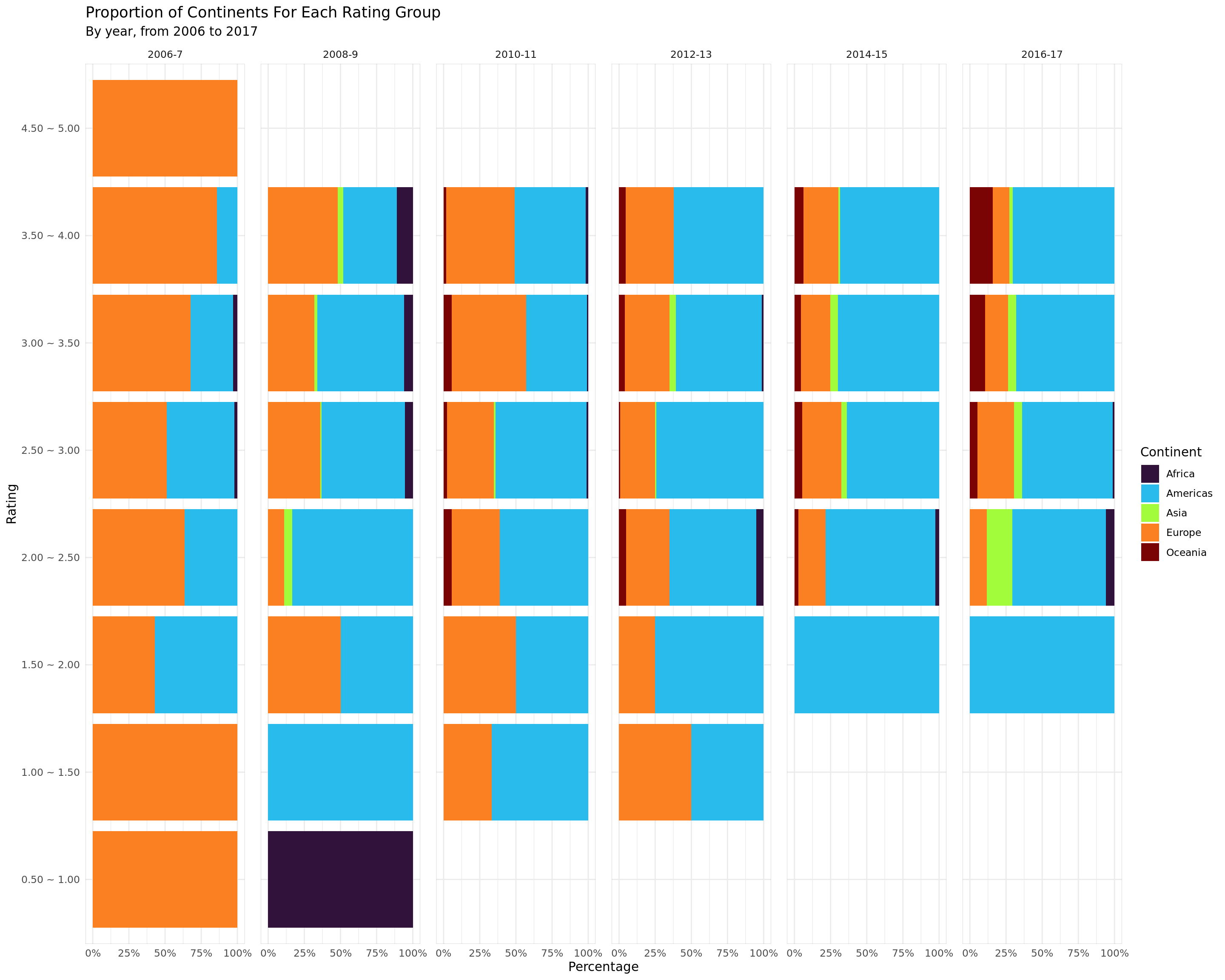
Figure 4
For our second plot, we will be observing the relationship between the continent in which the company is located and their review ratings for each of the year groups created in Plot 1.1. We thought that it would be interesting to see which continental group of companies have become more popular or preferred over time and also use this information to understand how different continents have improved in their performance over the years.
In creating this plot, we plan to implement stacked bar plots representing the proportion of continents where companies are located for each respective faceted year using bar plot function from ggplot2 with position = 'fill' option to create a stacked bar graph with percentage proportions shown instead of counts. Since we are focusing on the proportion, stacked bar graphs visually showing the percentage proportions and their side-by-side comparison along identical axis would be an effective way to interpret the changes in proportions over time. Then similar to creating the faceting year variable, we will create a new, factored variable rating_bin that groups the review ratings in 0.5 intervals (“0.0 ~ 0.5”, “0.5 ~ 1.0”) where the lower bound is exclusive with the exception of the first group. For our plot, we will count and accumulate the number of ratings for each continent where the companies are located in and finally represent the count of continents for each level of rating as percentage proportions using the stacked bar plots. The x-axis variable of the plot will be the percentage proportions of continents and the y-axis variable is the factored review rating levels. We will differentiate the continents by using individual colors for easier readability. In doing this, we implemented a scale function from viridis package to map each continent to different colors in the mapping we specified (option H). Lastly, we will facet the plot into the 6 time periods used in Plot 1.1 to observe how the continental proportions have changed during the time frame.
Analysis
Figure 3
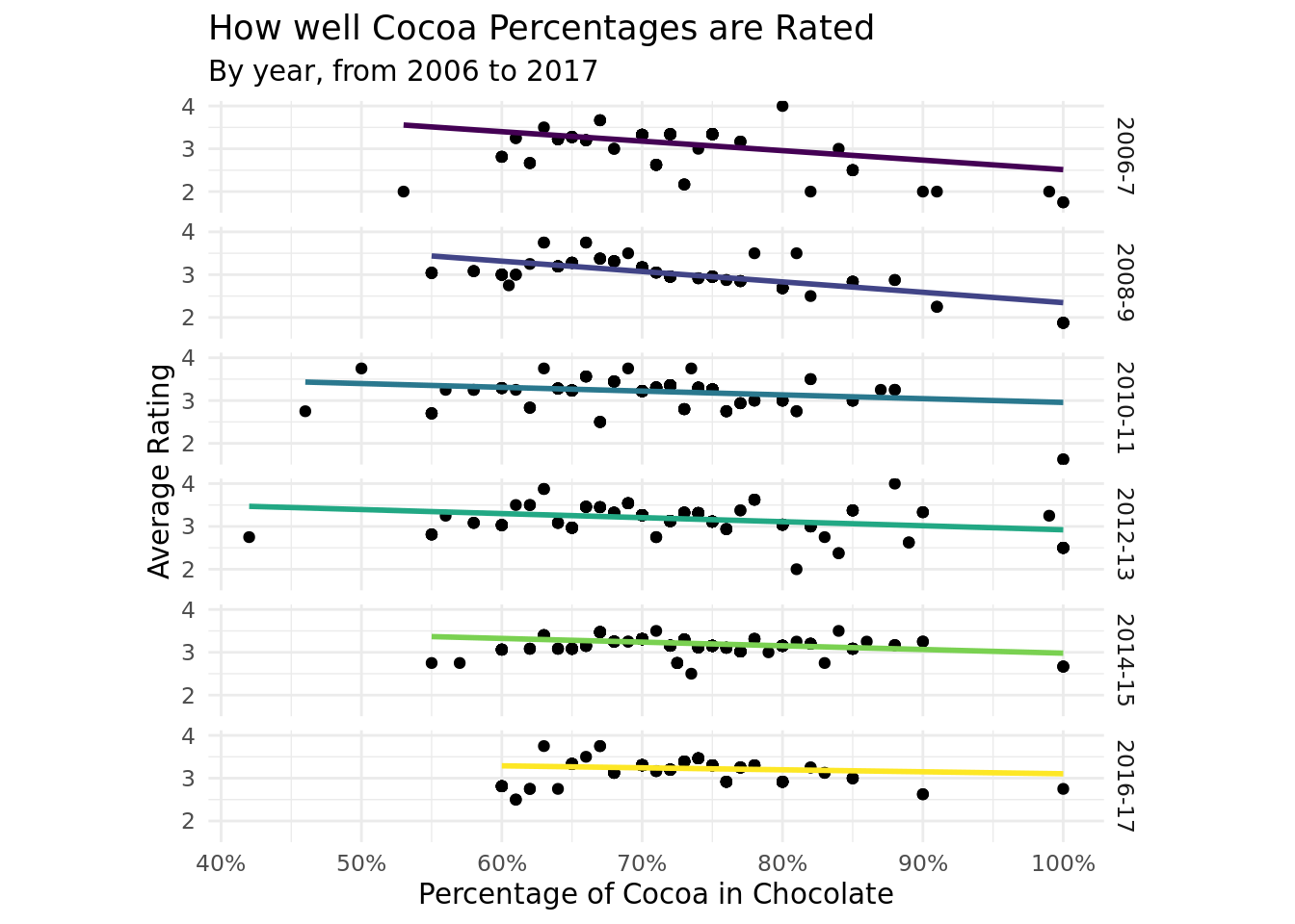
Figure 4
Discussion
Based on the Figure 3, it can be seen that in general, as the percentage of cocoa increases, the ratings tend to decrease, indicating that people tend to prefer chocolate with less cocoa in it. However, this trend has lessened as time has progressed. In 2016-2017, there is no clear preference for chocolate with higher or lower cocoa percentages, but in 2006-2007, the data clearly indicates a preference for chocolate with lower cocoa percentage. Additionally, the data does not seem to contain much chocolate with less than 50% cocoa, as these chocolates only have data in 2010 to 2013. This may be an indication that chocolate companies produced more low cocoa chocolate during those years, but it could just be a lack of observations in this data set.
We can observe from Figure 4 that in 2006 and 2007, higher proportion of the reviewed chocolate has been produced by companies in Europe with European companies taking up almost 90% of chocolate rated in the range of 3.50 ~ 4.00. However, from 2008 onward, we see that in general a large proportion of the chocolates reviewed are now produced by American companies. European companies are still present at higher ratings, taking up approximately 50% of chocolates rated in the range of 3.50 ~ 4.00. Then as the years go by, their proportions begin to reduce. This gradual shift continues until the final time period, 2016 ~ 2017, and by this period most of the chocolates reviewed are produced by American companies along with them producing most of higher-rated chocolates. Therefore it is clear from the plot that the preference for the general continental group of companies have changed over time from European companies to American companies.
In addition, this tells us that most of the earlier data points of our data set are mainly represented by European companies while those in the later time period are represented by American companies. This may further confirm that European companies have initially been dominant in their popularity as well as number of chocolates produced but American companies began outperforming them starting from 2008. We also see that in the later time periods, there are no chocolates reviewed above 4.5 or below 1.5. General rating range internet users may have become narrower in the recent years, with people giving increasingly specific ratings and having more similar palettes and experiences consuming chocolate.