Visualizing Factors Leading to Success in Eurovision Competitions
STA/ISS 313 - Project 1
Abstract
In recent years, the Eurovision competition has become the premier international music contest, and has spread from its European bubble to global fame. Thus, we have conducted a study to visualize important factors that could lead to success in these competition. The first part of our study asks if contestants from host countries do better than those who are not. Using a visualization, we were able to determine that being there is not string enough evidence to suggest that being from the home country gives a contestant a so-called “home field advantage.” The second part of our study analyzes whether performance order in the competition has effects on success too. Indeed, again using a visualization, we were able to determine that performance order did in fact impact contestant success, specifically that going earlier in the competition did not bode well for competitors. By analyzing these Eurovision trends, we are thus able to visualize and understand what factors lead to success in the competition, while also studying voter bias and inconsistency within the voter ranks.
Introduction
Eurovision is an international public song performance competition between European countries every year. Each country submits a song that is to be performed live to a centralized committee that plays the song over a common broadcast, and each country then votes on the other countries’ songs. The competition began in 1956, and has occurred every year with the exception of 2020 due to the COVID pandemic. As of 2022, at least 52 countries have participated at least once, with Ireland being the recipient of the most winners . The competition has cemented itself as a periodic staple for each country to present a culturally significant piece on an international stage, and its influence has spread outside of Europe in recent years.
The dataset, contained within eurovision.csv, consists of every song performed in Eurovision history, from 1956 to 2022. This data was collected from the Eurovision Song Contest website, and was found as a TidyTuesday dataset on GitHub. The dataset consists of 2005 observations and 18 variables, with each observation being a different song entered for the competition. The main variables used in this visual analysis are year (year of competition), host_country (where the competition was held), artist_country (the country the artist represented), running_order (the order in which the song was performed), total_points (total points earned in the competition), rank (rank of the song in the competition), and winner (a binary variable indicating whether the song won or did not win the competition).
Question 1: Home Country Advantage
Introduction
Our first question asks if contestants from the host_country in each competition tend to perform better than foreign contestants. We are interested in this question because hosting a competition at home is often seen as advantageous, especially in sports such as basketball and soccer where having a supportive crowd boosts team energy (and on the flip side unnerves opponents) and playing in a familiar environment helps players feel comfortable (plus not having to travel). Consequently, we want to see if there was a similar pattern for singing competitions like Eurovision, and if there is, to what extent it correlates with performance. The parts of the dataset necessary to answer this question are host_country, artist_country, total_points, rank, and year. We will manipulate some of these variables prior to plotting to best suit our goals; this methodology will described below.
Approach
We first create a new binary variable called from_host_country for each observation indicating whether the contestant is competing in their home country (done by matching the host_country and artist_country variables and returning “Yes” if a match, and “No” if not). Our initial plan was to use total_points and final rank as a proxy for contestant performance; however, we quickly realized that these metrics lacked standardization due to A) scoring rule changes over time, and B) a much larger contestant pool now compared to Eurovision’s early years, as more countries joining the competition increases the number of available points and rankings. While it is unfeasible to quantifiably account for the former, we account for the latter by converting rank to a percentile within every year’s competition, and total_points to a proportion of all available points in a given year’s competition. This ensures that the increase in contestants over time will not skew our results. These new variables are called total_points_prop and rank_pct.
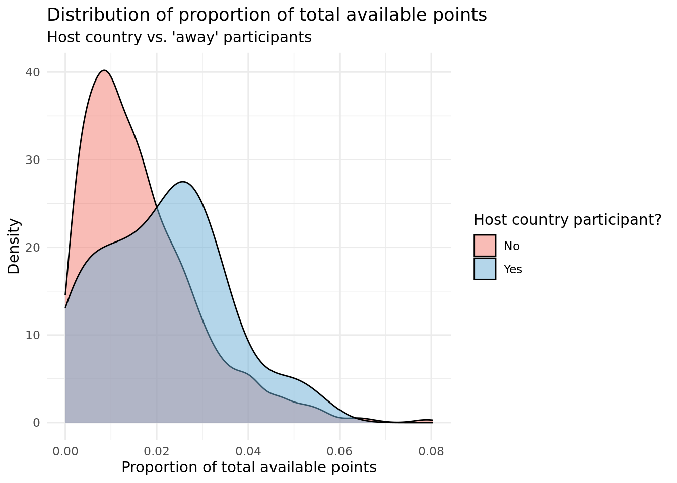
Our first plot is a density plot comparing the distributions of the normalized points between the 2 groups: one where it’s from the host country and one where it isn’t. The thought process behind making the density plot was to compare the distributions of (normalized) total points earned by contestants from host and non-host countries, while accounting for the difference in size of the two groups as the “no” group contains many more observations. The approach used was to create a density plot for each group, which shows the probability density function of the distribution of normalized total points for each group. By plotting the densities, we can compare the shapes of the distributions, rather than the raw counts or proportions of each group. The intent with this visualization is to discover whether there were any noticeable differences in the shape or center of the distributions between the two groups, and to communicate those differences in a clear and visually appealing way. The use of color and transparency in the plot makes it easy to distinguish between the two groups, and the minimal theme reduces visual clutter, allowing the viewer to focus on the shapes of the distributions.
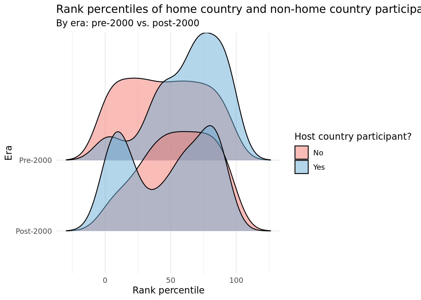
Our second plot measures how both host country and non-host country participants’ final ranks have changed over time (ie. whether home country advantage is more prevalent now than in Eurovision’s early years). We created numerous grouping variables of year, such as decade (which was highly imbalanced due to far more participating countries in recent years) and era (which was more balanced as we somewhat arbitrarily chose each time range). Ultimately, we elected to create and use a binary_era variable that indicated whether a given observation/contestant participated pre-2000 (includes 2000) or post-2000. The resulting ridge plot visualizes the distribution of rank percentiles among host country participants and non-host country participants, stratified by pre and post-2000 competitions. We chose to use this type of plot because its stacked/overlapped layout, along with the smoothened bins, allows for straightforward comparison of the pre vs. post-2000 distributions, as well as the host country vs. non-host country distributions.
Analysis
Discussion
The first density plot shows that there are noticeable differences in the distributions of total points earned by contestants from host and non-host countries. The “no” group, or non-host country contestants, has a left-skewed unimodal distribution, with the majority of countries having a lower percentage of the total points. This suggests that non-host countries may have a disadvantage in the Eurovision competition, perhaps due to factors such as cultural differences or language barriers. On the other hand, the “yes” group, or host country contestants, has a centrally skewed unimodal distribution, with a lower peak than the “no” group, but in general having a higher percentage of the total points than the “no” group. This suggests that host countries may have an advantage in the competition, perhaps due to factors such as familiarity or the home crowd advantage. It’s important to note that these are just preliminary observations and that further statistical analysis is necessary to determine whether these differences are significant. However, the density plot provides a clear and visually appealing way to compare the distributions of total points earned by host and non-host countries and to identify any interesting patterns or differences between the two groups.
In the second plot, we can compare the two non-host country distributions and see little skew or peak in both, with “away” country participants tending to perform slightly better post-2000. We do not see substantial evidence to draw any conclusions about lack of home country advantage impacting performance over time.
Honing in on solely host country participants, we observe a unimodal distribution of pre-2000 rank percentiles, while a more bimodal distribution post-2000 rank percentiles. While the rightmost peak of the post-2000 distribution is fairly aligned with the peak of the pre-2000 distribution - right around the 75th percentile - the leftmost peak occurs near the 10th percentile. Thus, the pre-2000 distribution has a much stronger left skew, leading us to conclude that home country advantage was more prevalent in 20th century Eurovisions than 21st century Eurovisions. One potential reason for this falloff could be the wave of digitization and media. More accessible forms of watching the competition, such as television, streaming, and online replays, might disincentive in-person attendance, even for fans residing in the host country. For instance, Italy, the host country of Eurovision 2022, boasted an average TV audience of 6.6 million viewers, up 53% year-over-year and by far the largest audience among all countries. Furthermore, “the number watching the Grand Final on YouTube rose nearly 50% year on year to 7.6 million unique viewers.” It is clear that online engagement has taken off and will only continue to do so, prompting many to watch for free from the comfort of their own homes, even if the competition is within their country.
Overall, based on the results from both plots, there is not a strong enough relationship between being from the host country and performance (points, rank) to make a legitimate claim.
Question 2: Performance Order and Success
Introduction
Our second question asks whether the order in which contestants perform affect their success. We are interested in this question because we wanted to see if voters were biased towards certain performances based on their performance order, as well as the legitimacy of mental factors like seeing other contestants go first vs. getting one’s performance over with early on. In these types of competitions, there is always fear of lack of voter consistency due to recency bias or boredom as performances continue throughout the competition. By observing if there are significant trends in how voters vote by performance order, we can gain a better understanding of these biases and how they affect the success of contestants. The relevant parts of the dataset are total_points, running_order, and year, some of which will again be manipulated with methods and reasons described below.
Approach
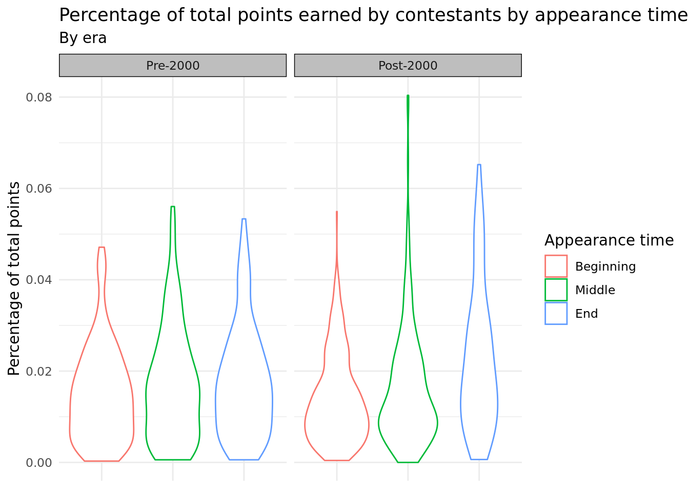
The first plot we use to answer this question is a group of violin plots comparing the adjusted percentages of points earned described in the first question (total_points_prop) by the appearance time of the song in the competition, defined as being in the first third (“beginning”) , second third (“middle”), or last third (“end”) of the performance by running order (running_order_group). These violin plots are then faceted by the era_binary variable (pre-2000 or post-2000), in which the competition occurred (as previously mentioned, we manually chose these eras to best balance out the number of observations in each era). A violin plot was chosen because this made it easier to observe the entire distribution of total points proportions for each of the groups, especially seeing peaks in the distributions. Furthermore, the skew of the distributions can be analyzed easily with violin plots, which can highlight which groups have more extreme outliers. Finally, the violin plots are faceted by era because we wanted to observe temporal trends in total points percentage for the three appearance groups.
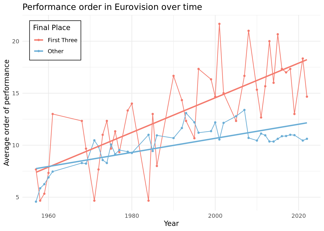
The second plot is a line graph with year on the x-axis and the average order of performance on the y-axis, colored by whether the participants placed in the top three or not (top3). A line graph was chosen because it is easy to see the trends of performance order temporally, and overlaying the lines allows for easy comparison. In order to prevent overcluttering and allow for easier analysis, we decided to plot the average order of performance rather than a scatter plot. For the same reason, we simplified the groupings to top three and not top three as there was not a significant difference in performance order across the top three, but the difference became more evidence as we included more places.
Analysis
Discussion
From our first graph, we observe that the modes for the distributions tend to lie under a total points proportion of 0.02, indicating that most contestants hold a small proportion of total points in their respective competitions, regardless of era or if they went at the beginning, middle, or end of Eurovision. Interestingly, the tails of the distributions for post-2000 contestants are much thinner, and extend more in a positive direction. Thus, it is evident that while contestants in newer competitions have been more capable of snagging higher total point proportions in their competitions, these make up a very small proportion of contestants. This is most evident for contestants who appeared in the middle of Eurovision post-2000, as this distribution reaches around 0.08 total points proportion, while exhibiting an extremely thin right tail, and thus, extreme right-skewness.
From our second graph, we see consistent results with the first one. For first, second, and third place finishers, we see an almost identical trend-line: a slight positive relationship between year and running order, suggesting that the top three finishers in Eurovision generally performed slightly later in the order than their predecessors from the previous years. Also, there is not a significant difference between the running order of first, second, and third place finishers. There does appear to be a difference from the first three and others though, with the trend line being slightly steeper for the first three. However, overall, the lines are so volatile that it suggests that running order is not a very strong factor in performance.
Combining the results from the graph, we conclude that performing later in the running order is correlated slightly with better performance than performing earlier, which could be explained by the fact that people may remember the songs performed towards the end more as they are the most recent in their memory when they vote. The trend that this has more of an impact in recent years could be explained by the fact that Eurovision has expanded over the years, meaning more performers, which would make it harder to remember the earlier performers during voting. Finally, the fact that the running orders of the top three finishers are not too different from each other despite the above results could be explained by the fact that running order matters more for distinguishing the above average from the rest but less for the best of the best.
References
https://eurovision.tv/
https://github.com/rfordatascience/tidytuesday/blob/master/data/2022/2022-05-17/readme.md
https://www.markhneedham.com/blog/2015/06/27/r-dplyr-squashing-multiple-rows-per-group-into-one/
https://www.aussievision.net/post/a-history-of-eurovision-rule-changes
https://eurovision.tv/story/eurovision-2022-161-million-viewers