The Great British Visualization
STA/ISS 313 - Project 1
Abstract
This project investigates viewership and baker performance in the Great British Baking Show using the data from TidyTuesday. Specifically, it analyzes how performance in technical challenges varies across demographics and how such correlates to a baker’s longevity in the show. The investigation of viewership analyzes how changes in the show’s network and presenters/judges correlate to the show’s popularity as well as how viewership varies between different points in each season (which episode numbers consistently get more viewership than others).
Introduction
Our dataset comes from TidyTuesday’s October 25th challenge; it can be found under the bakeoff package developed by Alison Hill, Chester Ismay, and Richard Iannone. All of the data is derived from the first ten seasons of the acclaimed reality TV show “The Great British Bakeoff,” which - over the course of each of its thirteen seasons (ten of which are documented in our dataset) - pits bakers from around England against each other in a series of technical (testing the acuity of one’s refined baking skills) and creative challenges. As fans of the show, this dataset jumped out at us right away, but what really sealed the deal in our decision to use this dataset is how diverse its vast array of both categorical and and numeric variables is.
The dataset includes 4 dataframes: bakers, ratings, challenges, and episodes. Bakers has 120 rows, each representing an individual baker and 24 columns. Ratings has 94 rows, each representing an episode, and 11 variables such as the ratings and the original airdates in the US and the UK. Challenges has details about the three types of challenges (signature, technical, and showstopper) as well as the performance of each baker (star baker, eliminated). It has 1136 rows, each representing a baker per episode, and 7 variables. As for episodes, it has 94 rows and 10 variables. Each row represents an episode and the variables describe different attributes of the episode like the number of bakers that appeared in it or the name of eliminated bakers. The variables that we use in this project include percent_episodes_appeared (the percentage of episodes a given baker appeared in out of all the episodes aired in that season), technical_bottom (how many times a baker appeared in the bottom 3 on a technical challenge), technical_top3(how many times a baker appeared in the top 3 on a technical challenge), technical_highest (the highest ranking earned by a baker on a technical challenge in the whole season - 1 being the best), technical_lowest (the lowest ranking earned by a baker on a technical challenge in the whole season), technical_median(the median ranking earned by a baker on all the season’s technical challenges), age (the age of a baker at the time of the competition), series (which season an episode comes from), viewers_7day(how many views the episode had in its first 7 days on the air), and uk_airdate (the date the show aired in the UK).
Question 1: How does a baker’s age and their performance in the technical challenges correlate to how many episodes they last for?
Introduction
Because a contestant’s overall performance in the show (and thus, ability to remain on the show) is determined by both their technical score and their creative score, we were curious which generations’ technical scores mattered most in their longevity. Thus, for generations where the technical challenge rankings are not as strong of predictors of the data, we can assume that for that generation, on average, creative challenge scores are a larger predictor of longevity. Identifying this pattern can help us understand how strategies and skill levels vary by generation. For instance, given millennials’ more free-willed reputation, can we expect that they’ll be more reliant on creative challenges, or should we expect that because older generations have garnered more kitchen experience, their technical challenge performance will be a stronger predictor of the percentage of episodes they appear in? To do this, we will use the bakers dataset and the variables percent_episodes_appeared, technical_bottom, technical_top3, tehcnical_highest, technical_lowest, technical_median, uk_airdate, and age. We use the variable age and uk_airdate to calculate the bakers’ birth years and subsequent generations under the variable age_generation. We had to use birth years rather than ages to create the generations variable because the show’s seasons span across several years, meaning that (because the ages are those of the contestants at their time of competing) the ages are not calculated at the same point in time for all of the contestants. The birth years of each generation were determined using this Mental Floss article
Approach
To first answer this question, we’ve chosen to use a scatter plot graph with linear trend lines, using percent_episodes_appeared on the y-axis. We’ve opted to use percent_episodes_appeared as opposed to total_episodes_appeared as our predicted variable because the number of episodes in each season varies, which means that the significance of how many episodes a person is in fluctuates based on the season (for example, being in 8 episodes of season 2 would imply making it all the way to the finale, whereas being in 8 episodes of season 3 would only imply making it to the quarter-finals). We’ve chosen to use a scatter plot because we wanted each data point to represent a specific baker. This format allows us to enable the ggplotly feature such that viewers can see each baker’s specific age, occupation, and hometown. Occupation and hometown had too many diverse observations to plot them aesthetically, but because these demographics could nonetheless reveal fascinating trends - or simply points of intrigue - in the data, we figured it best to include them within the plotly text (so that they don’t clutter the visualization but can be viewed at will). The combination of the scatter plot and the trend lines also makes it so that the audience can view any potential outliers in the data and peruse specific data points’ demographics with ggplotly while still having a clear means of seeing the trends in the data via the lines. The relatively high R-squared-values of our linear regressions (mainly those for the top 3 variable) also demonstrate how effectively the linear model fits our data set. The R-squared-values for the bottom 3 are notably low, which we address in our analysis. Finally, we faceted by generation in hopes of identifying a) which age group tends to last the longest in the competition and b) for which age groups technical challenge rankings are a larger predictor of longevity. To aid these two faceting goals, we added a rug plot to the righthand y-axis to make clearer around which section of the percentage of episodes appeared in the age groups most clumped. We also ordered our faceting so that the three most relevant plots would be side-by-side and thus easier to compare trends between. Because there’s only ever been one baker from the Silent Generation and 4 from Gen Z, we didn’t consider the trends in those plots to be markedly relevant.
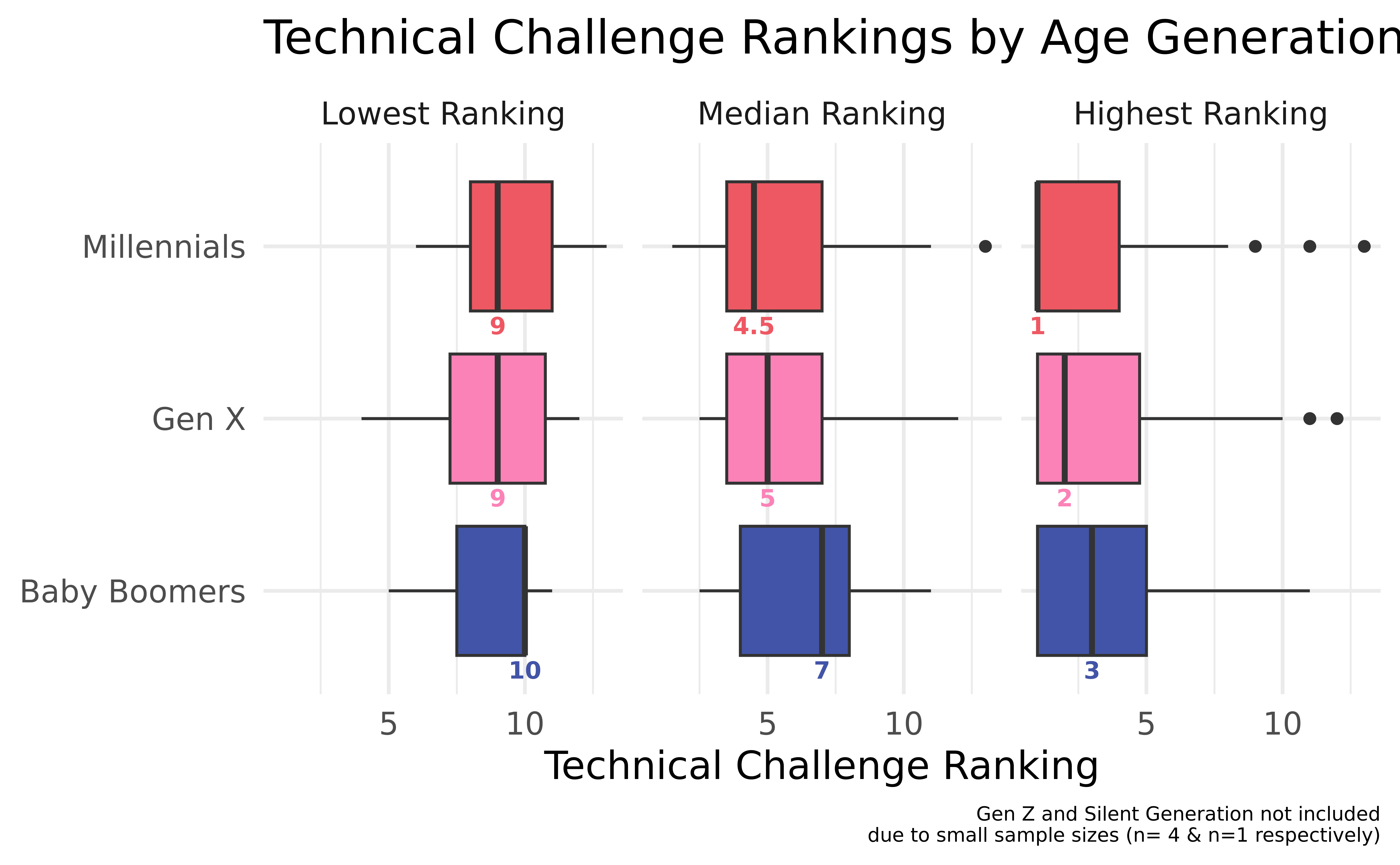
For our second plot, we chose to create a boxplot to compare trends in the bakers’ technical challenge scores and which generation tends to perform best in them. We used a box plot as opposed to a scatter or lollipop plot because we wanted to see the variation of each generation’s technical challenge rankings and a boxplot permits us to see the median, IQR, and outliers of each plot. Per our prior approach, we suspected that older generations - by nature of having more experience in the kitchen - would generally perform better in technical challenges, so we chose to do a different box plot for each age group. In order to curate all of these using one geom, we pivoted the data so that each baker had a separate observation for their highest, lowest, and median technical ranking, and then we created a new variable called score_type to identify which of the three rankings the observation represented. We chose to not include Gen Z and Silent Generation because of their sample sizes (n=4 and n=1 respectively). Finally, because the median is our main source of comparison between generations, we opted to make it extra visible by documenting its value under each plot.
Analysis
Discussion
Across all age groups with significant sample sizes, the number of times appearing in the top 3 and bottom 3 is positively correlated with the percentage of episodes appeared in, but across all generations, the number of times appearing in the top 3 is a stronger predictor of the percentage of episodes appeared in, as signified by its significantly higher R-squared values. Despite being an indicator of poor performance (which is typically associated with lower longevity in the show), the number of bottom 3 appearances is likely still positively correlated with the percentage of episodes appeared in because in order to appear in the bottom 3 more, one implicitly has to appear in more episodes. The Bottom 3 trend line’s low R-squared value across generations likely has to do with the fact that it’s positively correlated despite being an indicator of poor performance. Moreover, the y-intercept of the trend lines for the top 3 are all greater than those of the bottom 3 trend lines, implying that being in the top 3 correlates to being in a higher percentage of episodes than being the bottom 3 does. This correlation is reinforced by the fact that for Baby Boomers, Gen X, and Millennials, the trend line for the number of bottom 3 appearances and the trend line for the number of top 3 appearances are parallel, signifying that the number of times appearing in the top 3 and the number of times appearing in the bottom 3 are similarly related to the percentage of episodes appeared in (they have similar slopes) and that being in the top 3 is always more correlated with longevity in the show than being in the bottom 3.
The generational R-squared values indicate which generations’ technical challenge rankings accounted for a larger percentage of the variability in the relationship between technical challenge performance and longevity in the competition. Contrary to our prior belief, - of the three generations with noteworthy sample sizes - top 3 performance in the technical challenges was the strongest predictor of longevity for Millennials with a R-squared value of 0.737, followed by Gen X with an R-squared value of 0.689, and lastly, Baby Boomers with an R-squared of 0.617. Notably, though, all of these R-squared values are moderately strong and none vary too much from one another. The relatively small sample size of each generation could be partially to blame because the small sample sizes increase the impact of outliers in correlation calculations. In the context of the show, we believe this contradiction to our suspicions could also be attributed to the fact that none of the contestants (or none that we note upon a scan of the occupations using plotly) make careers out of baking, meaning that older generations haven’t spent much more time professionally refining their baking skills. Additionally, because the technical skills are taught at the top of each challenge, the younger generations’ better technical performances could be a reflection of their better absorption of new knowledge or better familiarity with trendy and unique techniques. Finally, on average, it appears that Gen X and Millennials tend to last longer in the competition than Baby Boomers because the rug plot points for Baby Boomers are clumped more heavily around the lower half of percentage of episodes appeared in whereas Gen X and Millennials’ data points are more equally distributed across the graph or concentrated on the upper half of the y-axis. This better overall performance could be attributed to the aforementioned characteristics that give them a leg-up in technical challenges in combination with any youthful innovation that may come to play in the creative challenges.
Based on the second visualization, we can see that, on average, Millennials tend to perform the best on technical challenges because the median of their median rankings is the closest to first place and the median of their highest rankings is actually equal to first place. Baby Boomers - on the other hand - perform the worst across the board because their boxplot medians are lowest for all three ranking summary statistics (maximum, minimum, and median). These results are consistent with the findings from the first visualization in suggesting that Millennials perform better and thus rely more heavily on their technical challenge scores in order to remain in the competition, which, again, likely reflects their quicker learning skills and awareness of trendy baking techniques. It’s worth noting that there are outliers for Millennials and Gen X in calculating the highest ranking and an outlier for Millennials in calculating the median ranking. Millennials and Gen X both have sample sizes that are more than double that of Baby Boomers, which would increase the likelihood that they have outliers. Finally, the plots for the highest and median rankings are all skew right, which makes sense because the highest rankings plots are concentrated around the highest possible rankings (which can’t exceed first place) and as the season progresses (and more bakers are eliminated), the lowest possible ranking decreases such that when they’re calculated into the median, there are significantly more high ranking values (close to 1) in the data set than low ranking values. It follows that most of the plots for the lowest rankings are slightly skewed left because although they’re concentrated on the lowest rankings, the lowest possible ranking gets closer to 1 as each season progresses and more bakers are eliminated.
Question 2: How do the different characteristics of each season and the progression of episodes within each season influence the show’s viewership?
Introduction
One of the most objective measures of a TV show or movie’s success is the number of viewers. As such, we decided to investigate how changes in format and platform impact the viewership as well as how viewership changes throughout seasons. In order to properly answer these questions we drew on data from Wikipedia about the different hosts, judges, and channels involved in the show throughout its run, adding them to the ratings_ppl dataset as presenters, judges, and channel variables respectively. We also use the group_by, mutate, and mean functions to find the mean 7-day viewership for each season. The 7-day viewership mean variable is our main indicator of the show’s success.
Approach
(1-2 paragraphs): Describe what types of plots you are going to make to address your question. For each plot, provide a clear explanation as to why this plot (e.g.boxplot, barplot, histogram, etc.) is best for providing the information you are asking about. The two plots should be of different types, and at least one of the two plots needs to use either color mapping or facets.
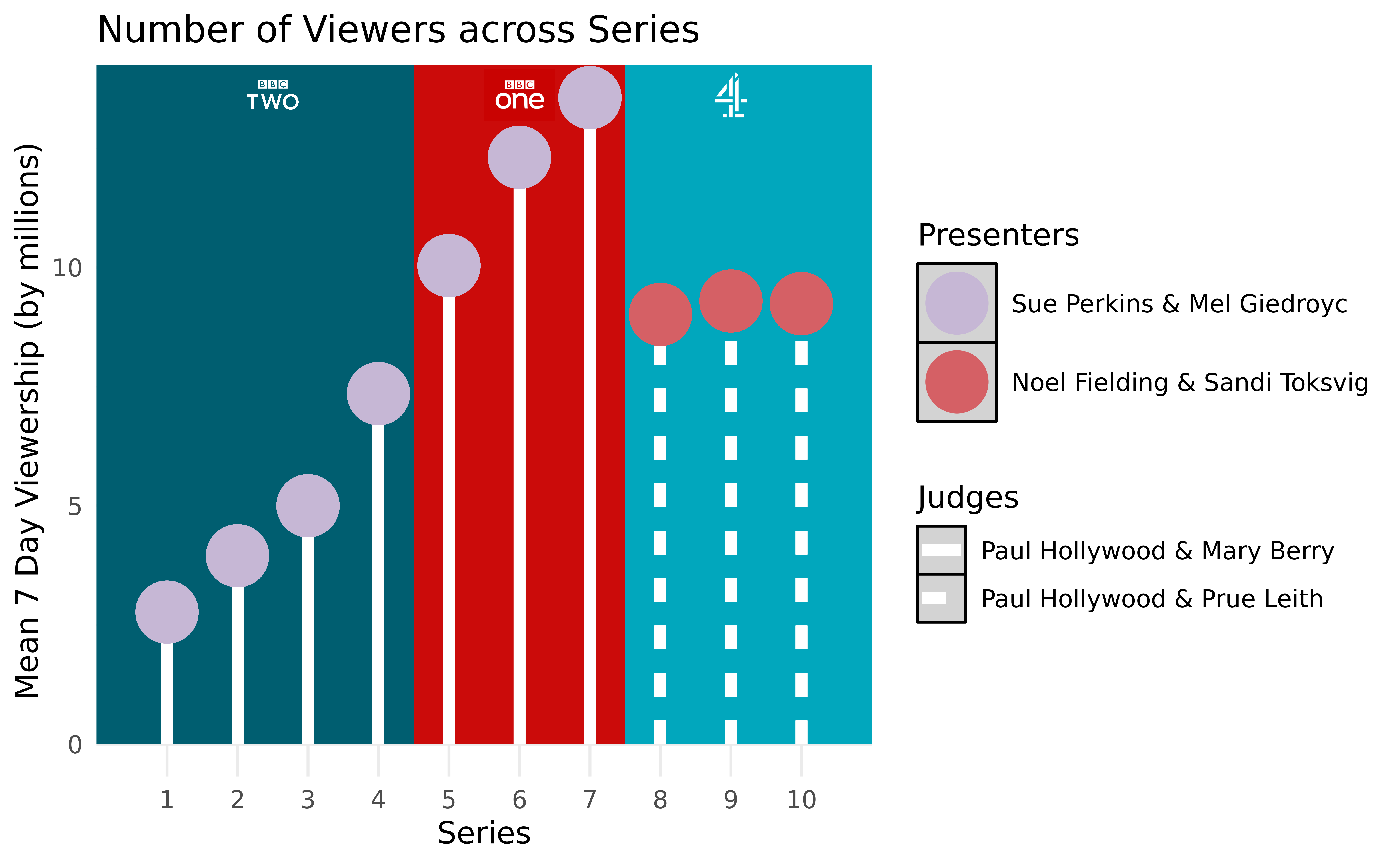
In order to compare the viewership distribution based on the presenters and network the show was on (which vary by season), we will plot the mean 7-day viewership for each season in relation to multiple different variables. The 7-day viewership gives an understanding of how many fans of the show are watching the show regularly. The first graph will plot mean viewership alongside visual prompts to show changes in channels and presenters so that it is easily seen how those changes can potentially effect viewership. We decided a lollipop chart would be best for this because although we initially intended to display boxplots to see the variation in each season’s 7-day viewership, the views were consistent enough across episodes that we could reduce our ink-to-data ratio by only plotting the mean viewership per season rather than the (rather condensed) median and IQR. The stems serve as an effective means of displaying the change in judges and of helping to ground the points as opposed to just using a scatter plot.
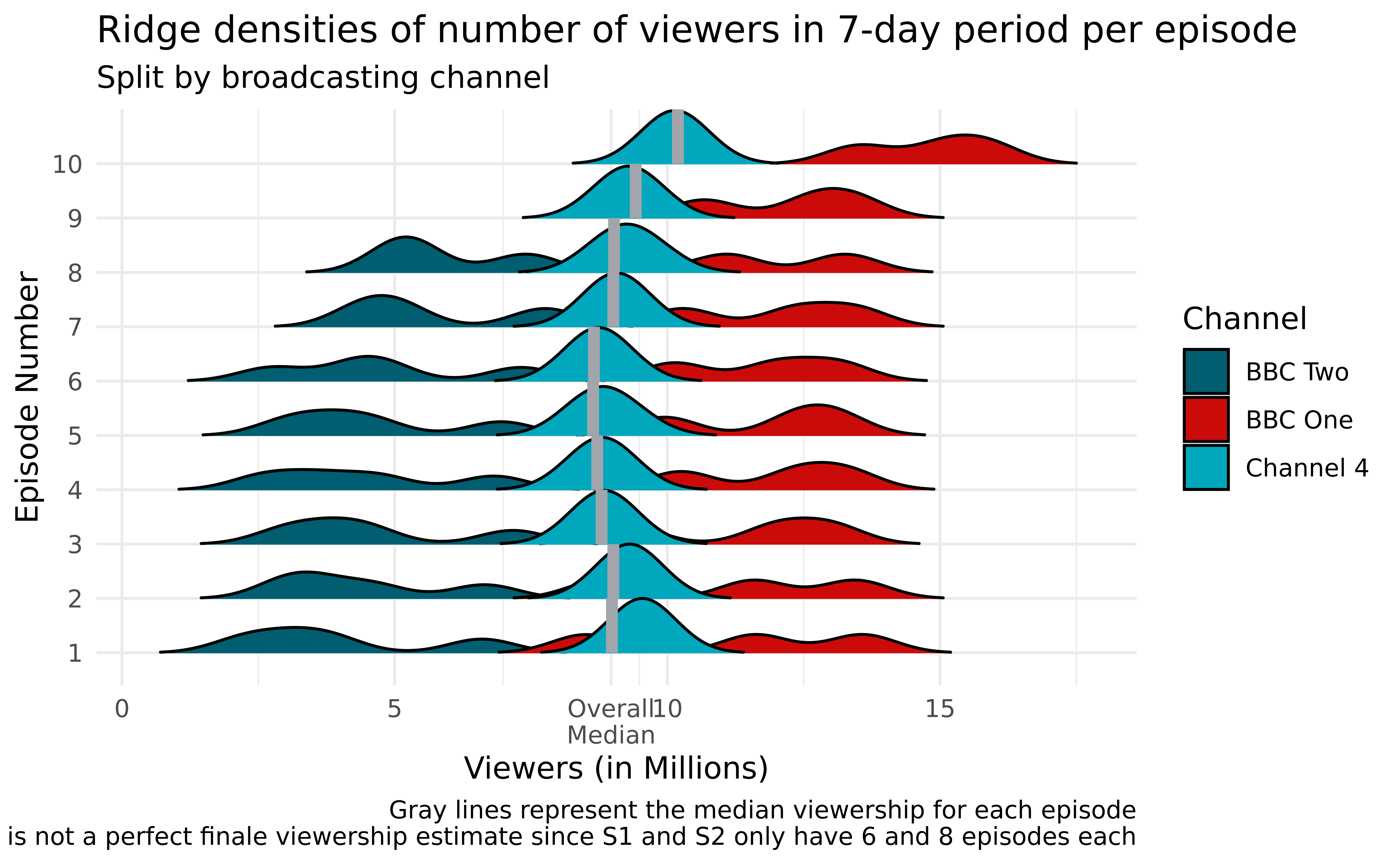
The second graph will explore how viewership changes throughout seasons. We used density ridges to plot the densities of the 7-day viewership for each episode across seasons because we wanted a smoothed density estimate to more clearly convey all 10 different episode numbers side-by-side. Additionally, we fill our density ridges with colors representing the network on which the season was broadcasted. This not only gives us insights into the impact of the broadcaster on the viewership but also serves as an indicator of the season number (Seasons 1-4 were on BBC Two, 5-7 on BBC One, and 8-10 on Channel 4)
Analysis
Discussion
The first graph shows how changes in the channels and, subsequently, presenters and judges can both positively and negatively affect a show’s viewership. When the show switches from BBC Two to BBC One, viewership continues its upward trend at an even greater rate, which makes sense provided that BBC One is a larger and more accessible network than BBC Two, mirror the success as the show built a platform of fans. However, after season seven when the show switches channels causing a change in presenters and judges, viewership not only drops dramatically but also sits stagnant. Because Channel 4 is entirely privately funded, it makes sense that they would be a smaller network with a different (and seemingly less successful) marketing strategy. The largest trends seem to be correlated moreso with the channels than with the presenters and judges of the show, which makes sense because none of the presenters and judges are particularly large enough names to draw or dispel audiences based exclusively on their appearance in the show. However, one could explain the drop in Channel 4 viewership as a product of people’s frustration with switching the presenters (from Sue Perkins & Mel Giedroyc to Noel Fielding and Sandi Toksvig), as well as the loss of Mary Berry as the second judge. These changes in the TV personalities caused the feel of the show to change, potentially adding to even further loss of viewership.
Looking at the second plot, we can see that the higher we are, the more the ridges go to the right. That is, the further we are in the season, the higher the 7-day viewership. This can be expected since more people are attracted to the last few episodes leading to the finale. Notably, the first season only had 6 episodes and the second only had 8 (but every other season had 10), so the finale episode is not always episode 10. However, because such is the case for 8 of the 10 seasons, we still feel confident in our conclusion that viewership ramps up for and in anticipation of the season finale. We also notice that the first episode has a high viewership compared to the episodes in the middle of the season. This is also expected since people usually like to watch the first episode of the season to get a sense of the bakers, and the season’s general vibe. It is normal that the viewership drops slightly after that episode, and picks up again towards the season’s end. It is also obvious that the show has relatively low viewership density during its first 4 seasons (on BBC Two), but the viewership increased drastically for seasons 5 to 7 on BBC One. After the switch to Channel 4, the viewership decreased again, still beating that of the first four seasons, and was mostly centered around the overall median 7-day viewership. The effect described earlier of early excitement, stagnation, then late excitement during the season is very visible looking at the Channel 4 densities, which almost form a crescent shape, with the tips being during the first and last episodes.