World Cup Scoring Trends
STA/ISS 313 - Project 1
Project Introduction
Our data visualization team, RGodz, has elected to use the FIFA World Cup data for our investigation. The 2022 World Cup recently came to a close in Qatar and was full of sensational story lines between FIFA’s corruption leading up to the event, the likely end to Cristiano Ronaldo’s international football career, and Lionel Messi’s fairy-tale victory in the final against a star studded French side led by Kylian Mbappe. Considering all of the sensational headlines and buzz generated by this most recent installment of the World Cup, our team thought this data would be particularly exciting and relevant to analyze.
This FIFA World Cup data was made available on Kaggle by user Evan Gower. The data is broken up into two datasets which we have renamed to matches and wc . It should be noted that while the most recent World Cup has sparked our interest in the data, the 2022 World Cup data is not included in these datasets.
Question 1: Goals per match by tournament stage over time
Introduction
How has the total number of goals scored in a match changed over time, and does the round in which a match is played correlate with the total number of goals scored in a match?
This question asks two questions in one. The first one deals with the total amount of goals scored during a match and how this has either increased, decreased, or stayed constant throughout the years. The second part of this question looks to see if the round that a match is played in has any association with the goal tally of that game.
The parts of the matches dataset that are necessary are the variables home_score, away_score, year, and stage. We will have to create a new variable that can be called total_goals that is the sum of home_score and away_score since we are interested in the number of goals scored per match. Also, we will have to do some data manipulation with the stage variable so that all group stage games are under the same category, as they currently have different names based on the group name (i.e. “Group A”, “Group B”, etc.) but are all a part of the same round of a World Cup. No external data is needed for this analysis. By answering this question we may be able to discern whether or not World Cup teams play a more conservative scheme as they get deeper in the tournament, as well as whether or not competing teams have become more or less attack-minded by looking at mean goals per match over time.
Approach
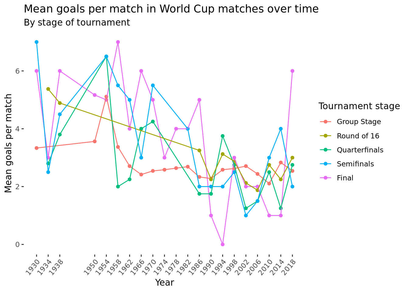
Following a suggestion from one of our peer reviews, for our first visualization to answer this question we will create a line plot with the average number of goals scored per game as the y-axis variable and year on the x-axis, separated by which round of the tournament. The chart would have different lines colored by tournament stage and display the change in average goals scored per game over the years for each round of the World Cup. This should give us a better sense of how goals scored per match differs by year and round on average as opposed to looking at the actual distributions in the violin plots.
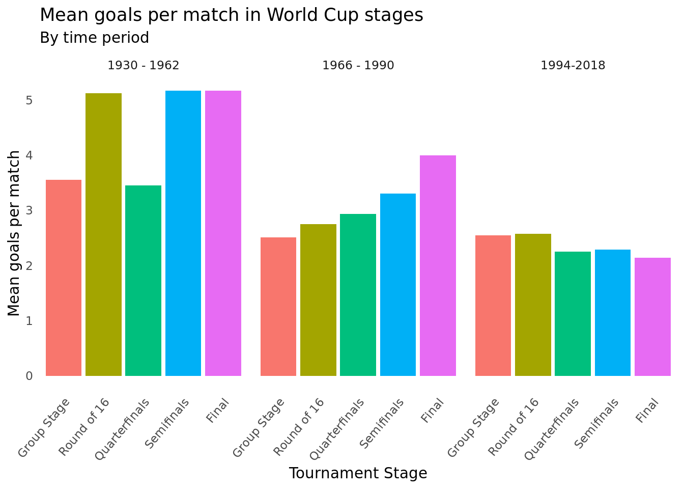
For our second visualization, we will create a bar plot for the distribution of goals scored for each round that is grouped by the time period. So the round will be on the x-axis and goals scored will be on the y-axis with each plot showing the distribution of the data points that came from a specific time period in the tournament. We will separate the time periods into three groups (1930 - 1962, 1966 - 1990, 1994 - 2018).
Analysis
Discussion
The objective of our analysis for this first question was to gain a better understanding of the relationship (if any) between the amount of goals scored in a match and which round of the World Cup said match is played. Taking this a step further, our team thought it useful to see if there existed any trends in this relationship that may have fluctuated over time. In our analysis, we decided to discard observations pertaining to the Third place stage of the tournament as this match is played after the two competing countries have already been eliminated from championship contention. Thus, it is understood that both sides would be less likely to play with the same competitive edge in a consolation game which may skew the result. Furthermore, we were required to perform some string manipulation in order to ensure uniform labels in the stage variable (i.e., Group stage, Final).
As displayed above in the analysis section, our team’s first plot depicts a multiple line graph showing the change in mean goals per match over time by stage of the tournament (distinguished by line and point color). When our group first asked this question, we thought we might observe trends like more goals being scored in group stage matches due to higher likelihood of mismatched opponents or team’s becoming more conservative in the later rounds as they face increasingly threatening opposition. However, from this first plot it is challenging to discern any concrete trends as far as goal tallies altering by tournament stage. We are able to note that the goals per match metric seems to be most consistent in the Group stage (teetering between 2 and 3 for much of the tournament’s tenure) which makes sense as this marks the first round of the tournament including the highest amount of matches (observations) which contributes to less variability. If we were to remove the 2018 final from our plot, it would be more clear that goals per match across all stages of the tournament seem to be decreasing overall from 1930 to 2018. The 2018 final marks the exceptionally high scoring and not so back and forth match between France and Croatia which ended in a 4-2 French victory. It should be noted that the tournament’s format has experienced changes throughout its history thus not every year contains an observation for all five stages. For example, the 1930 tournament featured only 13 countries while the 1974 and 1978 tournaments incorporated a unique format with 16 teams and two group stages. The years of 1942 and 1946 are void and left off of our plot as the tournament was cancelled due to World War II.
The second visualization which we have used to answer our question is a group of bar charts faceted by time period using a variable we created called year_group. The variable year_group chronologically divides the observations into three eras, each made up of seven World Cups, with the intention of depicting scoring trends in a more clustered fashion. When the data is visualized in this fashion, it becomes more clear that overall goals per match seems to be on a gradual decline from time period to time period. The tournaments from 1930 - 1962 appear to have had the highest goals per match of the three eras with the round of 16, semifinal, and final all seeing an entertaining five goals per match. Tournaments held between 1966 - 1990 saw a drop off in goals per match in each respective stage in comparison with earlier editions of the Cup. We are able to see that during this time period, goals per match increased as teams got deeper into the tournament as seen from the steady incline from the group stage to the final. More recent installments of the World Cup, as included in the 1994 - 2018 time period, also show a decline in goals per match in almost every single stage. It is also apparent that goals per match steadily decreased as teams made it deeper into the tournament with the later rounds seeing fewer goals compared with their earlier counterparts. This visualization may lead us to believe that teams used to be more attacking-oriented but have adjusted their schemes over time to be more conservative and defensively-focused. Of course, we are unable to necessarily make any conclusions just yet as to whether that is the truth or not, but this visualization does lead us to believe that goals per match have declined over time and that defenses may have become more talented or the pace of the game has shifted over time.
Question 2: Country Success over Time
Introduction
Over the course of the FIFA World Cup’s tenure, which nations have had the most success aggregated across all tournaments from 1930 to 2018 when considering semi-final appearances and overall goal differential?
This question has two parts. The first part asks about using a country’s amount of semi-final appearances to measure success over the FIFA World Cup’s tenure. The second part also seeks to measure success but instead of using semi-final appearances to measure this, it uses goal differential.
The parts of the dataset that are necessary are the variables winner, second, third, and fourth from the wc dataset. We will also use the team_score column the opponent_score column from the matches dataset to create a new column called goal_differential.
We are interested in this question because measuring success in the World Cup and ranking countries outside of championship tallies is not an objective task. However, our team is looking for a way in which we can best depict country performance over time by looking at both a result metric (semifinal appearances) and a performance metric (goal differential). Based off peer review feedback, we learned that others were also very interested in this topic and then modified our question based on the feedback.
Approach
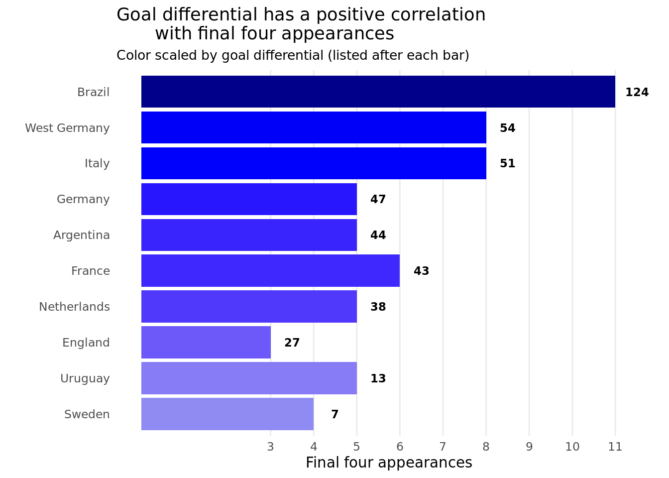
We will create two visualizations ranking participating nations on their all-time World Cup performance. For our first visualization, we will make a sideways bar plot looking at the variables winner, second, third, and fourth from the wc dataset. We will count the amount of times from 1930 to 2018 that individual countries have made it into the top four teams of the tournament, indicated by being listed as winner, second, third, and fourth in the wc dataset. This count will manifest as the plot’s x-axis with country names in descending order on the y-axis. We will then use a color gradient that is based on the goal differential. In order to analyze each country’s goal differential we must first do some data manipulation. First, we need to pivot the dataframe of matches longer so that each match now has two rows, with the home and away columns being switched to team and opponent ones so that every second row is the same as the row before it in the opposite order. In case this is unclear, for example if there was a match in which Spain lost to Morocco 1-2, the first row would contain 1 under the team_score column and 2 under the opponent_score column and the following row would contain 2 under the team_score column and 1 under the opponent_score column. Then, goal differential will be calculated as team_score - opponent_score. This visualization will give us a sense of which teams have had the most success with deep runs in the tournament over time.
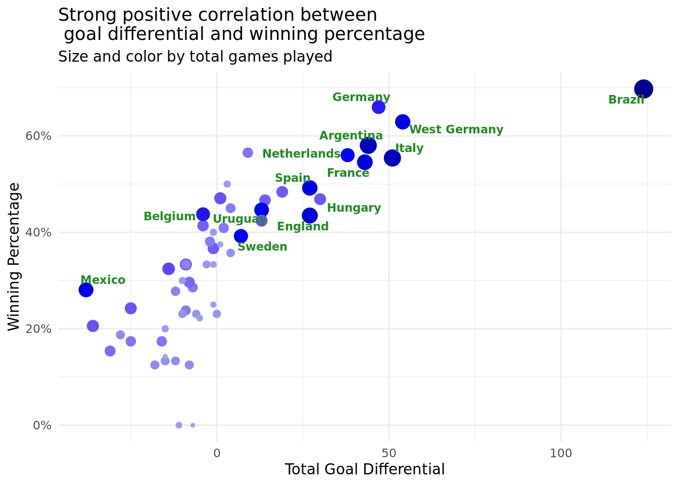
To answer the second part of our question we will be using data from the matches dataset. We will group the table by country and summarize using the sum of the new goal_differential column to be the dataframe we use in our analysis. The visualization will be a scatterplot depicting countries based on aggregate goal differential and use size and color of each point to track each nation’s goal differential in each World Cup with the new goal differential variable on the x-axis and the winning percentage on the y-axis. This visualization will give us a sense of how strong or weak the correlation is between a team’s winning percentage and their goal differential while also being able to gauge how that has varied between countries.
Analysis
Discussion
Our two plots give good analysis on which teams have had the most success over time as well as the effect goal differential has on team performance. Looking at Figure 3, we can see the best performing teams throughout the World Cup’s history along with their total goal differential (listed beside each bar) and number of final four appearances. Here we only included teams who had made the semifinals more than once to focus on a more manageable number of countries to analyze. Here, the overall trend is that total goal differential and final four appearances are highly correlated. The darker shade of blue each bar is demonstrates a higher positive goal total goal differential, and we can see the bars generally increase in darkness as their length increases. This makes sense in context considering we would expect countries who are consistently good over time to both have good margins of victory, on average, and make more runs to the semifinals and beyond. The one team that stands out apart from the rest in both this visualization and Figure 4 is Brazil. They have far and away the highest goal differential of 124, over double that of the next highest team’s (West Germany with 54). Furthermore, their 11 semifinal and finals appearances gives them the most out of any team. The only other country who comes close to this level of sustained success is Germany, since if you combine the numbers from both them and West Germany that would give a goal differential of 101 with 13 final four appearances. The reason we did not combine these two in our dataset is because we thought the success of West Germany, now no longer a country, was interesting from the perspective of students who were not alive during their reign at the top of international soccer.
Figure 4 focuses more on a different form of looking at team success at the World Cup, which is a country’s winning percentage. We calculated this by dividing a team’s total wins by their total number of games played, hence not taking into account any difference between a draw (which can happen in group stage matches) and a loss. We decided to only focus on wins since our focus is on identifying team’s who have had the most success, and the greatest success a team can have in a single game is a win. Similar to Figure 3, Figure 4 shows that teams that have more success typically have superior goal differentials. Here, we labeled the country’s who have either a goal differential greater than or equal to 25 or more than 39 World Cup games played. This gives us a good sense of the best teams over time, which includes Brazil and Germany as previously mentioned, as well as Argentina, France, and the Netherlands, to name a few. These countries are generally thought of as powerhouses in the international soccer world, so it makes sense that show up near the top right of all the points in the graph. There are a few other countries we want to highlight based on our findings from this visualization. First, Figure 4 reiterates how Brazil has had the greatest success over time with its outlier goal differential value. Second, Hungary showing up with a relatively strong goal differential was surprising, since they have not made a World Cup since 1986 based on our data. This finding exhibits how good Hungary used to be in the mid-to-late 20th century, which was something none of us had known about before. Lastly, Mexico showing up as having the worst total goal differential among the teams plotted was quite unexpected. They are generally thought of as having a good, but not great, team historically (which is why they have a decent number of games played), thus we did not think they would rank so low in this metric. We can conclude from this that perhaps Mexico is overrated by the international soccer community, possibly due to almost always making the tournament since they play in arguably the weakest world region (North America). To qualify for a World Cup, a team only has to outperform the other teams in their confederation, so Mexico has a consistently easy path in getting to the World Cup. Overall, our analysis of our second research question has given us insight into which teams consistently perform the best in World Cup tournaments, as well as provided some interesting findings on specific teams.