Financing College: Exploring Pell Grant Awards
STA/ISS 313 - Project 1
Abstract
As college students, we have a firsthand understanding of the impact receiving a Pell grant can have on one’s financial situation and educational opportunity. In this project, we first explore how the average Pell grant award has changed over time across regions. We then explore which states have seen the greatest change in the percentage of awarded Pell grants to total students enrolled in university over time. Interestingly, we find that while the average Pell grant awards increased over the time period of 1999-2017, the proportion of students receiving Pell grants has actually decreased over time.
Introduction
The pell data set was featured on TidyTuesday in 2022. It contains information on the distribution of pell grant awards to college students in the United States from 1999-2017. This data set is a compilation of yearly datasets collected by the US Department of Education. The original yearly data was reported by the USDE in different ways across the years, after which it was cleaned up to become the `pell` data set that will be used in this project.
The pell data set contains 100470 cases of Pell grant awards and contains 4 missing values. It explores the award amount in each school for each respective year represented in the data set. The variables in this data set include the state in which the school’s located, the total Pell grant award the school gave, the number of students at the school who received a Pell grant, the name of the school, the session year, and the year. Specifically, the variables NAME, FACTOR, and SESSION are all factor variables while the other variables are numeric. There are some important notes to keep in mind when interpreting the data set. Firstly, the variable STATE includes both US states and territories, meaning there are more than 50 possible observation types. Finally, the difference between SESSION and YEAR is that SESSION indicates the academic school year (which is between two numeric years)
Change in Average Pell Grant Award Over Time
Introduction
The first question we will be answering is: How does the average Pell grant award change over time based on the geographic region? In order to answer this question, we will rely on the variables STATE, YEAR, AWARD, and RECIPIENT while also creating two additional variables” the AVG_PELL_AWARD for each school and the REGION. We are interested in exploring trends by state and by region, outlined by the US Census are the Northeast, Southwest, West, Southeast, Midwest and US Territory. Our goal with this research question is to understand how average Pell grant award distributions vary across different geographic regions eligible for pell grant funding on a year by year basis.
We are interested in this question for many reasons. Firstly, we are interested in exploring which geographic locations have the most students that receive government support to obtain higher education. Additionally, we have to make inferences and observations about what geographic and demographic characteristics could explain the distributions. Secondly, we are also interested in exploring how these averages changed over time. This is important as it will allow us to draw connections between political administrations, pandemics, and other relevant moments in time from 1999-2017. Overall, this will better support our understanding of pell grant distributions and allow us to best understand their regional changes.
Approach
In order to understand how Pell grant awards change over time based on the geographic region, we created two visualizations that rely on the mutation of two additional variables which are AVG_PELL_AWARD per school and REGION.
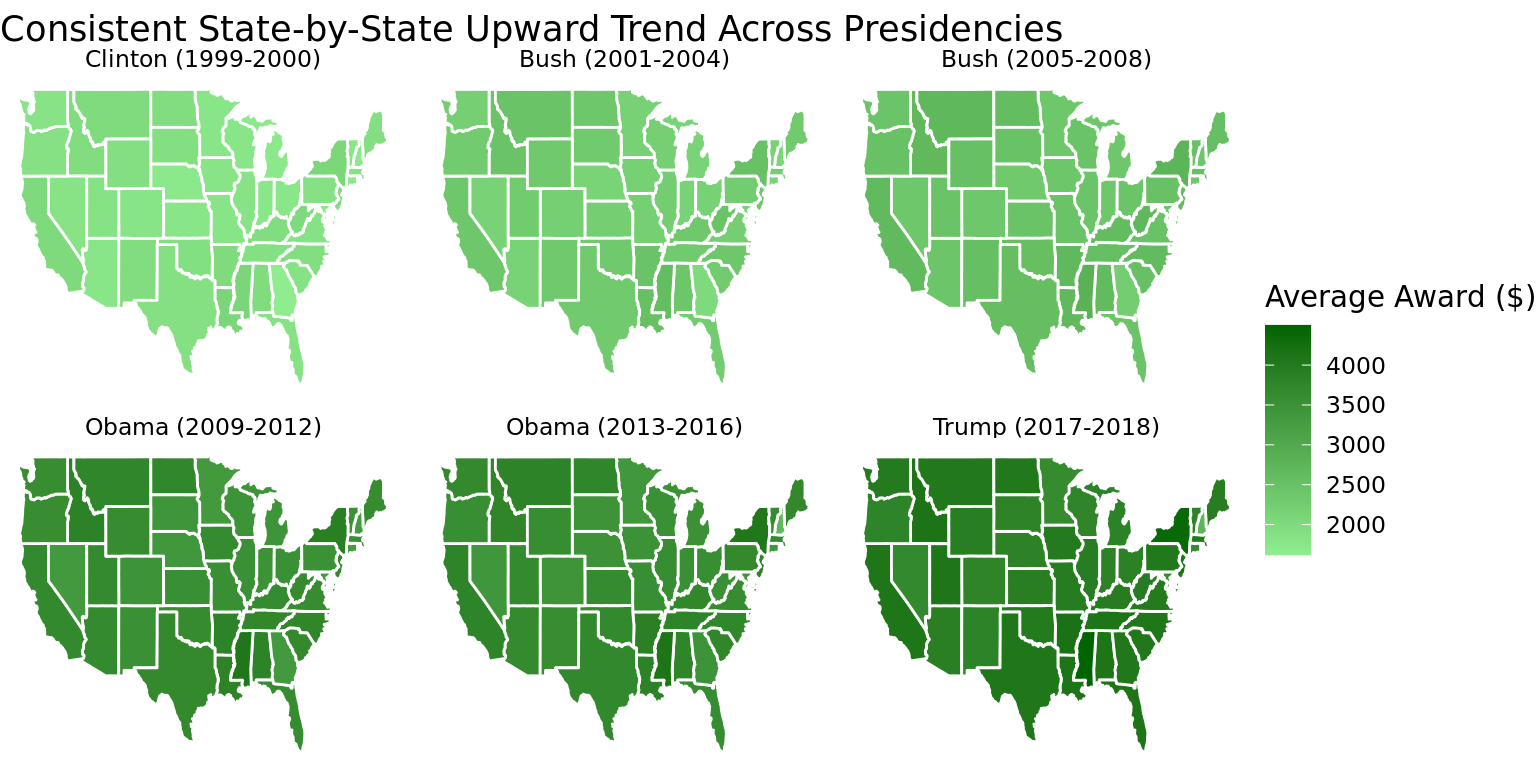
The first visualization is a spatial graph showcasing the average pell grant award across presidencies. It displays 6 maps of the United States (one for each presidential term) with each state colored based upon the average pell grant award in that state for the respective presidential term. This is the best way to visualize this information. In order to compare all 50 states at once, the only visually appealing way that is not overcrowded is a map. Additionally, the highest percentage of students that attend a college in a given state are from that state. Therefore, most students and families may be interested in learning about cost and grants at a state-by-state level, rather than large region. This is why we implemented state-wide information. Also, showcasing 6 different maps to display change over time allows for simple comparison without overcrowding.
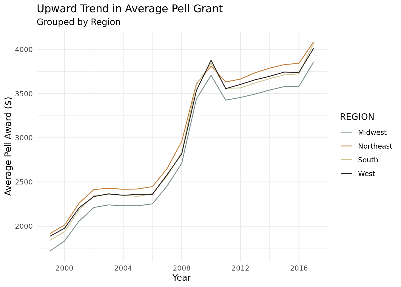
Our second visualization is a line graph which explores the time series progression of pell grant awards by region. Time (by year) will be on the x-axis and average pell grant award is on the y-axis, faceted by region. A line graph best represents the information we are seeking to understand in our research question because it provides a clear, year-to-year representation of pell grant awards for each region and allows us to visually observe the changes for each region of the United States. We chose to make the line breaks on the x-axis the year of presidential elections as we hypothesized that these years would have the most dramatic differences.
Analysis
Discussion
In Part I, we were interested in exploring how the average pell grant awards changed over time based on geographic region and through the creation of two visualizations, we were able to explore this and explanations for the general trends. In the first plot Figure 1, we explored the average Pell grant change for each state in the United States for each of the presidential terms in the 1999-2017 year period. Based on the visualization, we can see that over time, the average pell grant awarded in the United States increased by each presidential term, meaning that a greater amount of money per year is being allocated by the federal government for pell grant eligible students. The most drastic difference seems to be in between the 2005-2008 Bush Administration and the 2009-2012 Obama Administration and this could be due to the passing of The Health Care and Education Reconciliation Act (source) in which Obama dedicated $40 Bn USD to increasing Pell grants in the United States. Across presidential terms there are comparatively low amounts of pell grants in the states Nevada and Minnesota, contrasting comparatively high amounts of pell grants in New York and Mississippi. Maybe relate this to the presidential term.
In Figure 2, we can see that the average Pell grant award increased over from 1999-2017 for all regions of the United States. This can be attributed to multiple factors including inflation (both generally and specific to higher education tuition), increasing completion of higher education, as well as increasing fiscal spending over time. Again, we can see a collective spike in 2010 that can be explained by the passing of The Health Care and Education Reconciliation Act in 2010 by the Obama Administration, positively supporting pell grant distributions across all regions of the United States. This figure also makes clear that the average Pell grant award over the last twenty years has doubled. In addition to this, despite the similar trend, we can see that the highest average pell grant award was seen in the Northeast and the lowest was in the Midwest. This could be due to the fact that there are a greater number of students and universities in the Northeast than in the Midwest. Notably, we can see in this figure that in 2010, the average pell grant award for the Midwest was the highest. This could be due to the pell grant program expansion’s popularity in increasing access to college education for a significant amount of students in the Midwest.
What these two visualizations, both independently and together, do not clearly show us is the role of presidential political affiliation in the Pell Grant investment amount. While we are able to infer that Pell grants increase over time, we are not clearly able to see the difference between presidential terms. For future analysis, it would be interesting to further explore this .
Change in Proportion of Students Receiving Pell Grants Over Time
Introduction
Our second part seeks to answer the question: which states have seen the biggest change in the percentage of awarded Pell Grants to total students enrolled in university over time? Our goal with this question is to understand which states have seen the greatest changes in their proportion of students receiving Pell grants awards from 1997 to 2017. The variables in the data set we will rely on to answer this question include the state, location of the school, the total amount of yearly spell grant recipients, and the year. We will also incorporate enrollment data for the total number of students enrolled in university by state for each year, denoted by the variable proportion_receiving_pell (source). With these variables, we hope to understand which states have seen increases, decreases, or little change in the proportion of students receiving a Pell grant award over time.
We are interested in exploring this question for many reasons. Firstly, building off our previous question, we can see that there is a significant increase over the designated years in the average pell award across all states, collectively. We were interested in further exploring this to see where exactly most of these Pell awardees go and where they have increased, decreased, or stayed the same over time. We specifically highlight the states that have the significantly memorable proportions of pell grant awardees over time in our first visualization and infer potential reasons for these characteristics. Understanding this will provide a snapshot into where students who receive Pell grants go, the characteristics of the institutions they choose, and other meaningful understanding.
Approach
The first visualization is a line graph showcasing the proportion of students receiving a pell grant in each state over time. The x-axis is the year and the y-axis is the proportion of students receiving a pell grant in each state over time. Each state has a line showcasing its trend, however we highlighted the four most interesting states for analysis - Alaska, Wyoming, Delaware, and Idaho. The line for all other states is set to a muted gray color with a low transparency. This visualization allows viewers to compare the change in proportion of students receiving a pell grant over time for the most noteworthy states. It presents all states in order to allow viewers to have a mean of comparison and better understand the significance of highlighted states. Aesthetic features are carefully considered to avoid clutter and confusion.
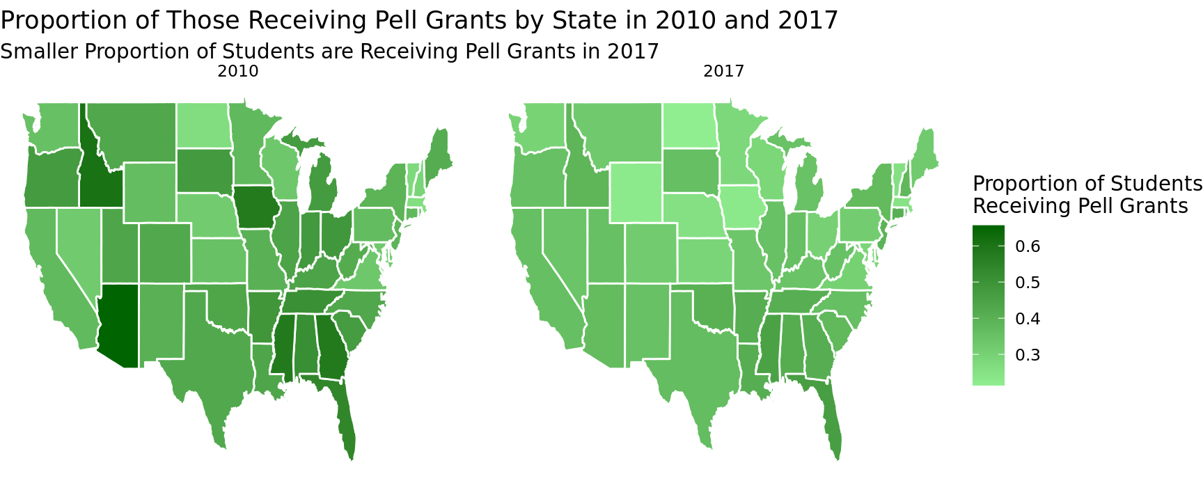
The second visualization displays two spatial graphs of the United States. One for the year 2010 and one for the year 2017. In these graphs the states are colored based on the proportion of students receiving pell grants that year. This is the best approach to showcase this information as a spatial graph allows an easily digestible presentation of data for all 50 states at once. We only displayed two maps, as the years these maps represent are the most interesting for analysis, and we wanted to minimize clutter.
Analysis
# A tibble: 51 × 2
   STATE dif_prop
   <chr>    <dbl>
 1 AK      0.0670
 2 AL      0.0994
 3 AR      0.0906
 4 AZ      0.312
 5 CA      0.0386
 6 CO      0.112
 7 CT      0.0421
 8 DC      0.117
 9 DE      0.0339
10 FL      0.126
# … with 41 more rows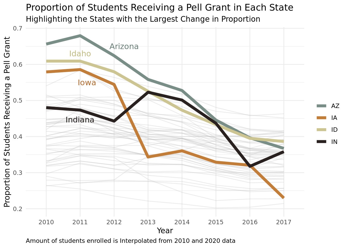
Discussion:
In part II, we were interested in exploring the which states have seen the biggest change in the percentage of Pell grant awards to total students enrolled in university over time. Our visualizations provided us with meaningful reasons for why.
In Figure 3, we visually represented the proportion of students receiving Pell grants in each state, specifically highlighting states we believed to be most relevant due to their large change in the proportion of students receiving Pell Grants. Overall, for the highlighted states of Arizona, Idaho, Iowa, and Indiana, it is clear that the proportion fo students receiving Pell grants at these institutions has decreased from 2010 to 2020, indicating that a smaller percentage of students attending colleges or universities in these states received Pell grants. This could be due to an overall decline in college enrollments seen in many parts of the United States (source). This could mean less students are applying for federal aid. Another explanation could be that less students are applying for federal aid and Pell grants due to thinking they are ineligible, lacking information on how to apply, and other reasons (source). Overall, this visualization makes clear that there is a downward trend in the proportion of students receiving Pell Grants. We are interested in how this relates to financial aid policy as well.
In Figure 4, we have a side-by-side comparison of the proportion of students receiving Pell Grants in 2010 and 2017. Overall, we can see that the proportion of students receiving Pell grants has decreased, indicated by the lighter shades of green. When zooming into individual states, notable states such as Arizona, Idaho, and Iowa have seen a drastic decline in the proportion of students with Pell grants. This visualization also shows that for states such as North Dakota and New York, the change in students receiving Pell grants seems to have remained the same, something we were not able to clearly see in Figure 3. This could be due to the fact that New York’s population of students and colleges is larger while North Dakota’s is generally smaller and has always been. Connected to Figure 3, Figure 4 allows us to view a state-by-state change representation in the proportion fo students receiving Pell grants and allows us to make inferences about reasons why some states have seen reduced Pell grant awards and others have not seen a significant change.
References
https://educationdata.org/college-enrollment-statistics
https://obamawhitehouse.archives.gov/issues/education/higher-education/investing-in-pell-grants-to-make-college-affordable
https://www.bestcolleges.com/research/college-enrollment-decline/
https://nces.ed.gov/pubs2018/2018061.pdf